Using a Form
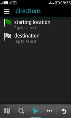
With Forms you can create many types of MIDlets; using a Form is not limited to data entry but can be used for much more. For example, Maps for Series 40 full touch is done with Forms. All the below mentioned components are supported in Forms, both portrait and landscape mode. You can mix and match the wanted components as needed; they will be displayed under each other in the order you define.
- StringItem (see Forms for more information):
- Text,
- hyperlink, or
- button.
- TextField (see Text input for more information).
- ChoiceGroup (non-expandable multiple and exclusice choicegroups; expandable popup choicegroup. See Radio buttons and Check boxes for more information).
- DateField (i.e. Tumblers, see Date and time fields for more information).
- Gauge (i.e. Slider, see Gauges for more information).
- ImageItem (see Forms for more information):
- Image,
- button, or
- hyperlink.
- CustomItem (see below and Forms for more information).
- Spacer (see Forms for more information).
- Ticker (see Forms for more information).
A header bar is automatically drawn to the top of the form. It contains the title of the screen, options list icon (dimmed if no commands have been defined), and action button 1 icon if the icon command is defined. The back button is located at the lower right corner. The form will become scrollable if your content does not fit the screen.
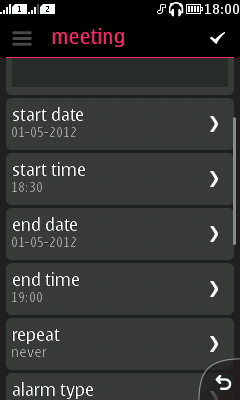
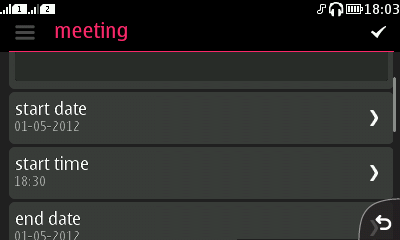
There are a few predefined icons that can be used for the action button 1; Add contact, Ok (the default 'tick' mark), and Send SMS. You can also create your own icon with the icon templates.
Following logical order
When designing a form to collect information from the user, you should think what would be the logical and natural way for the user to provide the needed information. For example, when adding a new meeting to a calendar, the first thing most users want to write out is what happens and where. After that, start and end times. Other information, such as a description, is usually more or less optional to give.
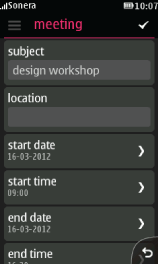
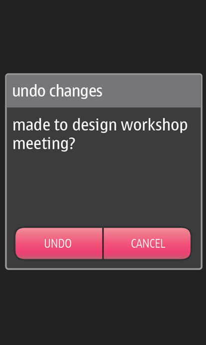
A form should have a clear way for cancelling and confirming actions when needed; see figure above with action button 1 and back button. If the user backsteps from a form without saving the changes, make sure you use an alert to confirm that it is what the user wants. Otherwise the user might lose the information they have just given.
With the CustomItem you can basically draw anything on your form. For example, you can use the MapsAPI to have a map.
